If you want to know what are the primary colors, then this article is for you. Primary colors alone make it possible to create all possible and imaginable hues. Zoom on the theoretical bases to create mixtures and color palettes!
Color theory is at the crossroads of graphic arts and physical sciences. The matter around us absorbs individual waves of light and reflects others that our eye perceives colors, and our brain interprets them.
By mixing them in variable proportions it is possible to obtain any shade of any color perceptible by the human eye, they are therefore used for any color synthesis (screens, visual arts, mood lighting or artistic).
After our detailed articles on the code and symbolism of colors, and the one on color associations, let’s come back to theoretical fundamentals to learn a little more about these famous elementary colors. So let’s know more what are the primary colors.
What are the primary colors?
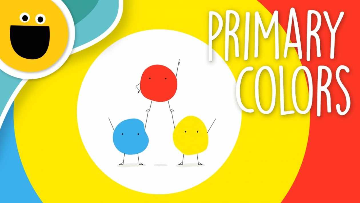
When we talk about primary colors in everyday language, we think of red, blue, yellow. And sometimes even green! However, it is not because these four primary colors frequently use to correspond to those we call the primary colors. How to navigate? Primary colors are the smallest set of basic colors that combine to produce all of the colors in the visible spectrum.
The primary colors are three in number but are not the same in additive or subtractive synthesis .
What is a primary or elementary color?
The primary color is a shade that cannot achieve by mixing other colors, unlike secondary or tertiary colors. It is from the primary colors that we can reproduce all possible colorimetric nuances.
There are two distinct methods to define the concept of primary colors:
- the one using the light beams
- that based on a mixture of pigmented materials.
If we refer to the process which combines different colored lights, namely the projectors of theaters or, more commonly, the screens, the three primary colors are:
- red
- green
- blue
The addition of these three colored lights produces white light, while a total absence of light obtains black.
We speak of additive synthesis since we start from Black by default, to which we add tinted lights until the desired shade obtain.
If you are working on digital media, computer screens, television, or smartphones, it is essential to set your RGB colors for a qualitative rendering.
In the field of film photography or color printing, opaque pigmented material is used and not light. If we keep red, green, and blue as a base, the absence of light does not allow us to obtain sufficiently clear and differentiated tints: we tend very quickly towards brown or black.
That is why the three primary colors which make it possible to obtain all the other shades are different for the print. We use :
- cyan blue
- magenta-red
- yellow
There is no need to invest in an incredibly extensive color palett me in painting: if you have these three primary colors, you can create any shade!
The case of print: CMYK
In the case of printing, you have certainly noticed that there are four ink cartridges: Cyan, Magenta, Yellow, and Black (# 000000).
Why add black, which is not a primary color and could obtain by mixing the three elementary colors? Entirely only for the sake of economy: the black cartridge allows documents to be printed in grayscale while being less greedy on the number of pigments taken from the other cartridges.
Secondary and tertiary colors
The three secondary colors result from a mixture of 2 elementary colors in equal proportions. We obtain :
- orange (# FFA500): by mixing magenta and yellow
- green (# 008000): from yellow and cyan
- purple (# EE82EE): with cyan and magenta.
The six tertiary colors come from a mixture of a secondary color and a primary color:
- orange
- carmine
- light green
- Emerald green
- ultramarine blue
- purple.
What is pure color? Example of the color wheel
The color wheel is an ordered schematic representation of colors, theorized by Newton in the 17th century. He understands :
- the three primary colors (red, yellow, blue);
- the three secondary colors (green, orange, purple);
- the six tertiary colors.
On the chromatic circle, we can distinguish on one side the so-called warm colors (yellow, orange, red, etc.), which often evoke joy and summer. On the other, the cold colors (green, blue and purple hues) are more austere but soothing.
These 12 colors are so-called pure or frank colors: each being the most saturated shade of a given color. They obtain without adding white, black, or gray.
Shades and color variations: what are neutral colors used for?
We speak of neutral color to mention the colors that do not appear on the chromatic circle, namely black, white (#FFFFFF), and gray (# 808080).
Sometimes excluded from colors by purists, they nevertheless have essential properties in graphic design:
- adding white lightens a tint;
- black, on the contrary, darken it;
- and gray tarnish the color.
These three neutral colors, if added to other shades, allow for endless color variations.
In graphic design, they are often used to highlight other colors thanks to the contrast they induce. It allows specific details to highlights to emphasize
What is saturation?
In colorimetry, saturation is the intensity of the coloring of a color. If the light is essential, the pigment becomes more lively. On the contrary, dividing the light values results in a less dynamic, paler, or dull shade. For example, brown, absent from the color wheel, is nothing more than a desaturated orange.
White, black, and gray are not colors: What are the primary colors?
As we have seen previously, we distinguish, on the one hand, the colors from a scientific point of view, and on the other hand, those used by artists and graphic designers.
If we adopt the physical sciences’ point of view, white and black are not strictly speaking colors but testify to the presence or absence of light.
On the other hand, Black is the visual interpretation of an absence of light: an object in our environment seen black if it does not reflect or emit any light.
Don’t we say that all cats are gray at night? It is quite simply because the absence of light reflection pushes our brain to interpret our environment in shades of gray.
But in this case, can we say that gray is a color? Neither more nor less than Black and white, of which it is ultimately a luminous variation. However, there are few neutral shades of gray, as there is often a dominance of other shades. Grays are generally shades of a too desaturated color.
However, when you create a visual medium or paint the walls of your living room, the question is not whether we can speak of colors in the literal sense but whether you want to use them or not in your creations. In this case, white, black, and gray will undoubtedly be part of your palette, just like other hues on the color wheel and their variations.
Four ways to create a color palette
When you want to use colors harmoniously, creating a color palette is a critical step. You will thus avoid the pitfalls of a lack of taste or a lack of contrast, which would affect your work’s legibility.
Complementary color palette
One of the most frequently used solutions is to choose opposed colors on the color wheel.
Monochrome color palette
Before doing so, start with a dominant and add variations to it for a layered effect.
Analogous color palette
In this case, we associate similar nuances on the chromatic circle.
Triadic color palette
We opt here for a combination of 3 shades spaced equally and triangularly on the color wheel.
Are you choosing colors: objectivity or subjectivity?
If you have followed us so far, you will have understood that the art of handling colors is not innate. There are specific codes and principles to acquire and respect to give your graphic productions the right tone. If the stains have their own identity, they also have cultural connotations. Learning to feel their strong evocative power will help you create a graphic image that suits you and declines it according to your projects.
As in any creative process, it’s up to you to find the balance between theoretical references and the risk-taking you can afford, to give your productions that little extra that will make them unique!
Biological origin of primary colors
The existence of three primary colors is linked to the tri-color character of human vision. The perception of colors is indeed done thanks to three kinds of cones (photoreceptor cells) which line the retina of the human eye. One of these kinds of cones is mainly sensitive to red light, the second kind of cone is sensitive to green light, the last kind to blue light, and these three colors coincide with the primary colors of additive synthesis .
Two-color vision (like that of some mammals) is associated with two primary colors while four-color vision is associated with four primary colors.
Primary colors in additive synthesis
In additive synthesis, the three primary colors correspond to the colors detected by each kind of cone of the retina: they are red, green and blue.
The addition of all these primary colors in the same proportions (with the same intensity) gives a white light .
Primary colors in subtractive synthesis
They correspond to the complementary colors of the additive synthesis’s primary colors: they are yellow, cyan, and magenta.
FAQ of what are the primary colors?
- What are the 5 primary colors?
Five tubes of gouache primary colors: primary blue, black, white, yellow, and red.
- What are the real colors?
In a ‘true color’ image, the three corresponding primary colors assign to the spectral bands acquired in blue, green, and red wavelengths. Red assigns to the red stripe, green to the green stripe, and blue to the blue stripe.
-
What are the colors called?
The terms used exclusively white, black, purple, red, orange, yellow, green, blue, purple, ivory, cream, beige, pink, khaki, brown, brown, burgundy. These colors can modify by pale, gray, dark, clear, medium, dark, vivid, intense, deep, and by a neighboring color indicating the trend, as in “yellow.”
-
Why are white, black, and gray not colors?
As we have seen previously, we distinguish, on the one hand, the colors from a scientific point of view, and on the other hand, those used by artists and graphic designers. If we adopt the physical sciences’ point of view, white and black are not strictly speaking colors but testify to the presence or absence of light.
On the other hand, Black is the visual interpretation of an absence of light. It is an object in our environment black if it does not reflect or emit any light. Don’t we say that all cats are gray at night? It is quite simply because the absence of light reflection pushes our brain to interpret our environment in shades of gray.
Conclusion of what are the primary colors?
Finally, here is the ultimate article about primary colors. Three basic colors in the world of color. But why are all three colors basic, not more or less? The two types of photosensitive cells in the human eye. The rod and the angle cell are the angle cells that create the sensation of color in our brain. These angle cells are of three types. These three types of angle cells can properly create the concept of three colors in the brain.
In fact, angle cells produce sensations according to the wavelength of the color of light. Light wavelengths of short-wavelength, mid-wavelength, and long-wavelengths vary in color. And they create sensations on different types of angle cells. Because of the feeling of three colors, people can basically recognize all three colors. For this reason, all three colors come up as basic colors for humans and vertebrates. This religion of man is Tricromacy.
However, having four types of angle cells in fish and birds allows them to distinguish four colors, or better yet, ultraviolet colors.